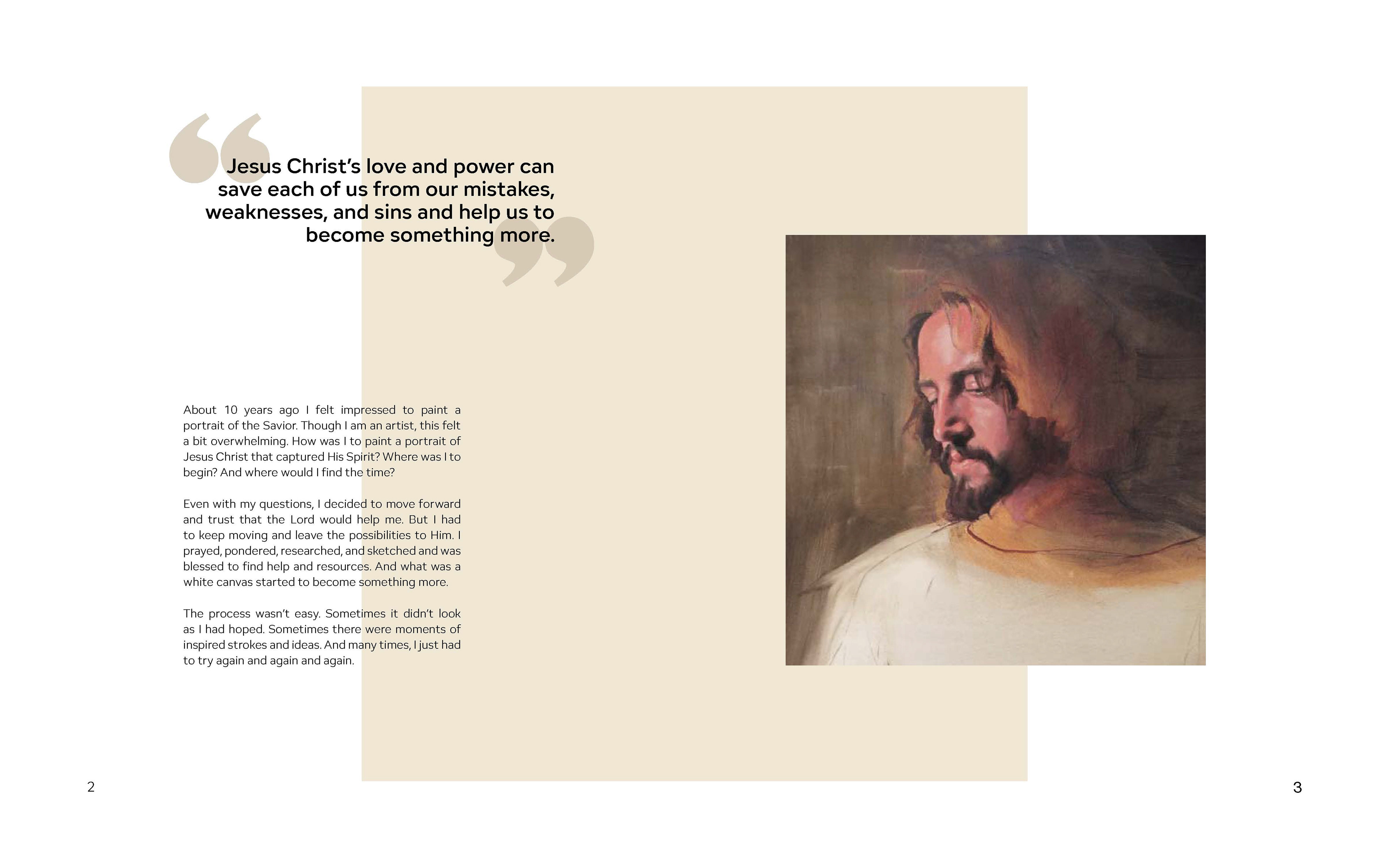
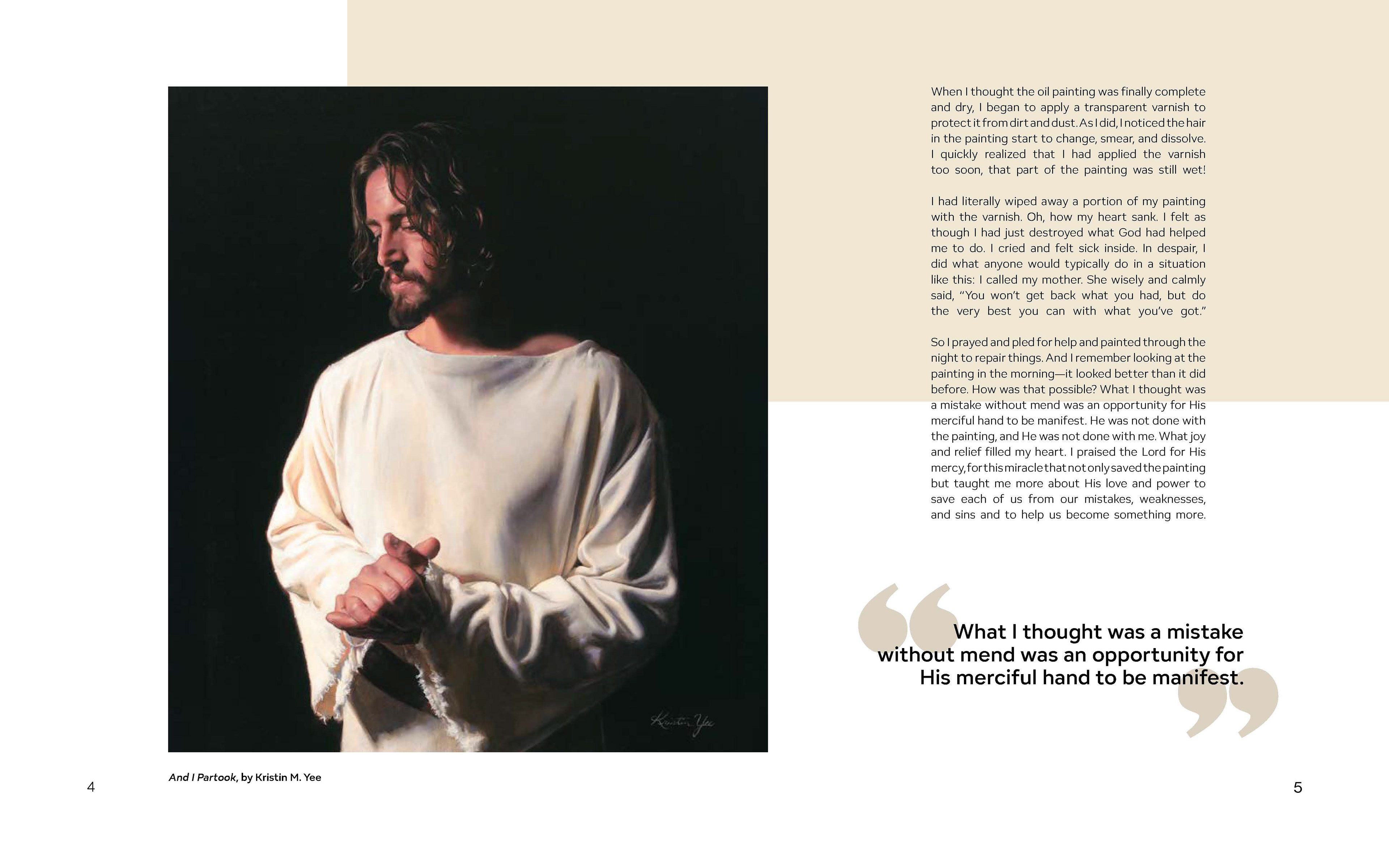
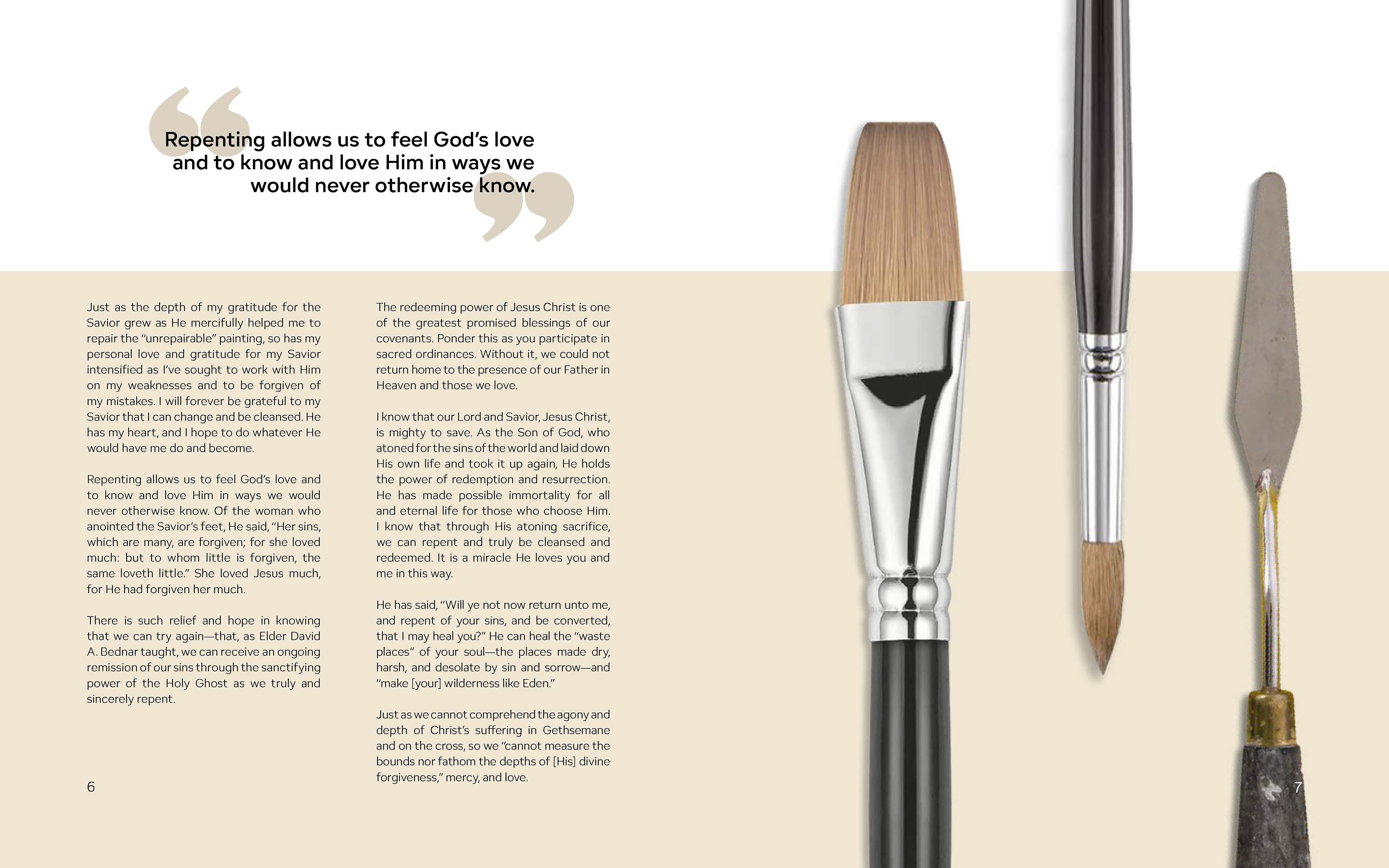
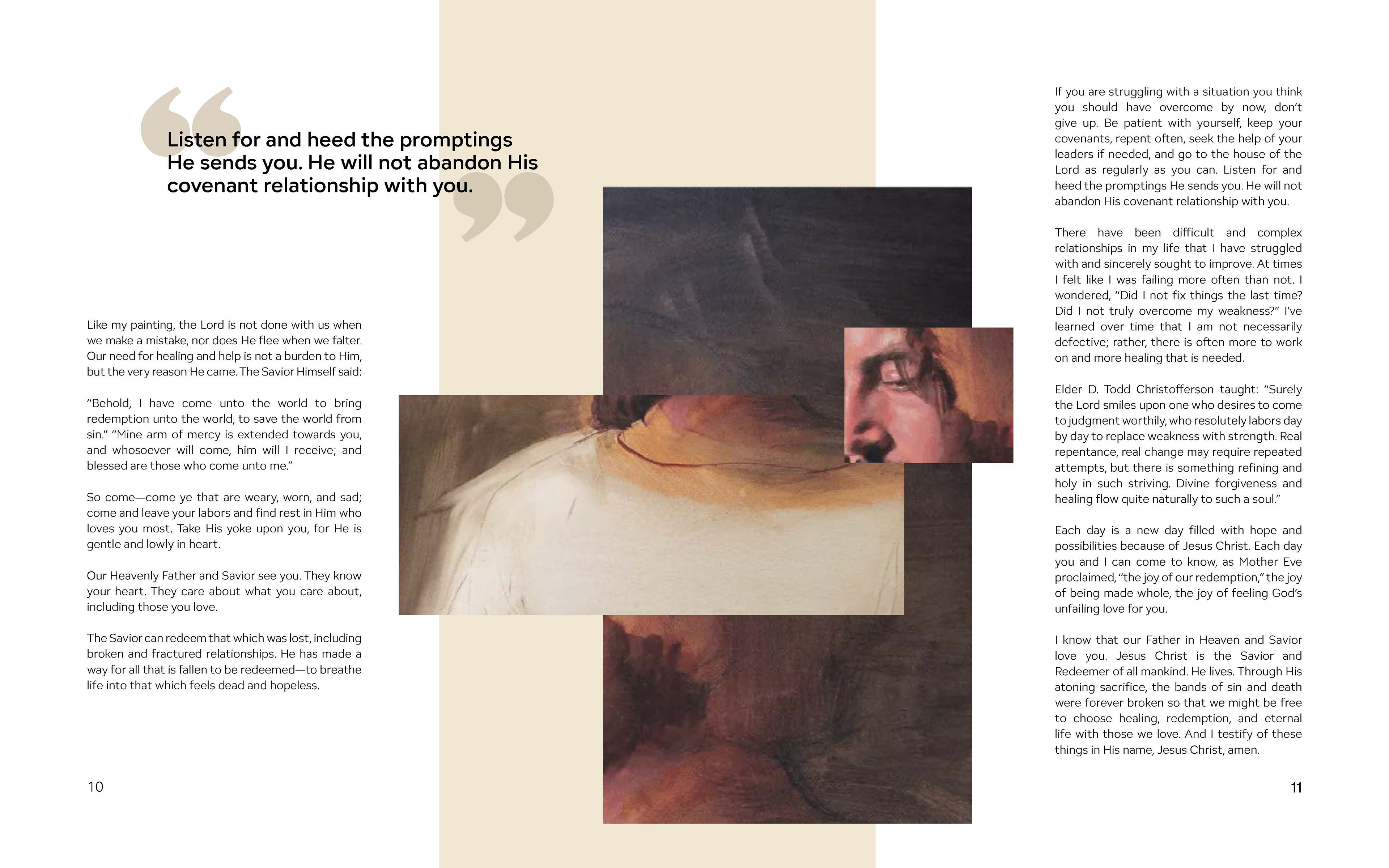
For this project, I designed a multi-page printed magazine featuring an article, focusing on strong typographic hierarchy to keep readers engaged with both the content and visuals. My goal was to create a piece that was both beautiful and functional; something worth reading and sharing. I prioritized legibility and storytelling, ensuring every element supported readability and visual symbolism.
ART 230 | Disciplines: Editorial Design, Typography, Layout & Composition, Visual Storytelling, Print Design, Information Design, Color Theory, Image Curation
